
What should I wear? 4 tips for what to wear to your fall Omaha portraits!
It is a question that I get asked a lot with my senior and family portrait clients: what do I wear? In fact, if I had to take a guess, I’d bet that it’s one of the most asked questions that most portrait photographers get! As part of the boutique service I provide, all of my seniors and families receive a personalized website where they’ll find a downloadable wardrobe and style guide, customized color palettes based on their favorite colors & locations, pinboards with links to outfits from their favorite stores, and for any other questions, my contact information.
I love incorporating color theory into my photographs - it can take an image from good to great. And with fall upon us, there’s some beautiful color combinations that work extremely well with Mother Nature’s autumn colors. Here are 5 ideas to get you started!
Tip 1: Soft and soothing
Fall doesn’t have to be about bold, rich colors. Sometimes pairing a soft, pastel color against the yellows and reds of fall leaves can be really beautiful. Normally when we think of pastels, we think of spring - and rightly so! But the juxtaposition of a soft color against the bold backdrop of fall foliage can create a striking image.

Light blues, grays and pinks evoke a soft feeling in these images.
Tip 2: Bold, but muted
When fall is in full force, the colors are so vibrant and rich! Pairing your outfits to match can also create a rich image that truly captures the magic of fall colors. I tend to prefer bold, but muted colors to soften the feel of the image a bit. However, bold has it’s place! More saturated, primary colors can convey different feelings and can give an image more “pop”. I tend to use bold colors when I have a single subject. Otherwise, using too many bold colors on several subjects can look like competing colors.

The image on the left is the original. The image on the right I’ve altered the colors to make them more bold and saturated. Which do you like?
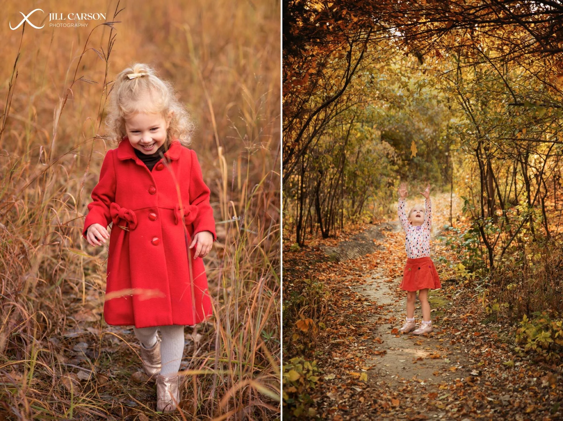
Both of these images are taken at the same general location, but in one image my subject is wearing a bright red coat, and in the other a more muted, orange skirt. The bright red coat evokes a sense of energy and playfulness while the orange gives just a bit softer feel.
Tip 3: Coordinate, don’t match.
When in doubt, start with one outfit and build from there. My own family will be having our portraits taken while on vacation and I fell in love with an outfit at one of my favorite stores. After putting my own spin on it, I then built outfits for the rest of my family based off of what I’d be wearing. If your first outfit is a print, then pull the colors from that print and go from there. If your first outfit isn’t a print, I try to incorporate a print in another outfit to tie it all together and give some variety.

Notice in each of these family portraits that at least one family member is wearing a print of some sort. Prints can help to pull all of the colors together and break up the monotony of solid colors.
Tip 4: Refer to Sir Isaac Newton
No, really! Did you know that he invented the first color wheel? And now the principles of color theory derived from the color wheel have been used by artists and designers for hundreds of years to create pleasing color palettes. There are several color harmonies that you can use when putting different outfits together. Rather than going over all of them, here’s just a few that I like to use.
Analogous - three colors next to each other on the color wheel. (Can be less than 3)

Yellow and green are next to each on the color wheel.
Complementary - two opposite colors on the color wheel

I changed the dress color to purple in this image. Purple and yellow are opposite each other on the color wheel.
Split Complementary - Three colors total. The initial color and the two colors opposite but next to the initial color.

Triadic - three colors equally spaced on the color wheel.


Ready to get started?
I’d love to chat with you about your family or senior portraits!