Why I don't edit every image in black and white
Have you ever wondered what makes a great black and white photo? Or perhaps you’ve worked with a photographer in the past who delivered both a color and black and white version of every image to your gallery. While there’s nothing wrong with doing so, this isn’t something that I do, and I want to tell you why.

To begin, every single image that I take is individually prepared. What I mean by that is, there’s no generic preset or one click button that I press to edit each image. Yes, I have created my own presets over the years to reflect my style and personal tastes for contrast, color and the like; but those are generally used as a starting point. Each photo is then individually examined and hand edited with additional adjustments to create a unique piece of art. As I work through each image, there’s a thought process for each image as I make decisions about how I am going to edit.
Let’s start with 3 reasons why I would keep an image in color.
The color tells the story
Let’s look at the three sets of images below.
In the first set, the images were taken at the Sarpy County Fair. The bright and vibrant colors of the carnival rides are part of what make these images special. Had I converted these images to black and white, they would not have the same effect.
Likewise, in the images of the mother and daughter, the gorgeous sun setting over the lake was a part of the story I wanted to tell. Not only was the sunset itself beautiful, but the colors lend to the feeling of peace and love that I also wanted to portray in this moment between a mother and her daughter. The yellow of the dress and the wild flowers in the field also lend to the mood of the image of the girl twirling, evoking a sense of happiness and being care free.
In the last image, the red of the stadium seats with the red lettering of the baseball uniform tell part of his senior story - his school colors play a vital role!

Lack of tonal contrast
When an image has limited variation in tones, the image will fall flat when converted to black and white. The image below was taken on a family vacation. Notice all of the blues? It’s almost monotone. There isn’t enough contrast in colors to make it a strong black and white image. In the image of the boy and dog, notice how the dark color of the dog blends in with the dark jeans that the dad is wearing. Converting this to black and white would have made it harder to tell the story of the boy and the dog.

The light isn’t right
In the same way that I look for tonal range, I also look for contrast in light. Does the image have a wide range of darks and lights (shadows and highlights)? In the top two black and white examples below, I knew before I took the picture that I would be converting to black and white. In the first image of the child, I placed her in what’s called dappled light. The strong shadows and highlights create an interesting image with depth and even mysteriousness. In the image of the senior girl, I placed her face directly in the sun. The harsh light causes deep shadows behind her that give the image depth and interest when converting to black and white.
In the last set of images of the little boy, the conversion to black and white isn’t doing much. Not only are the colors of the grass and his skin and hair too similar to create any contrast, the light is also flat, creating little contrast to make the black and white version very interesting.

And now, for the reasons why I convert to black and white.
Sometimes, when I take a picture, I’ll know before I take it that I will be converting it to black and white. Other times, I’ll convert later. But in both cases, the decision to convert to black and white is done for specific reasons.
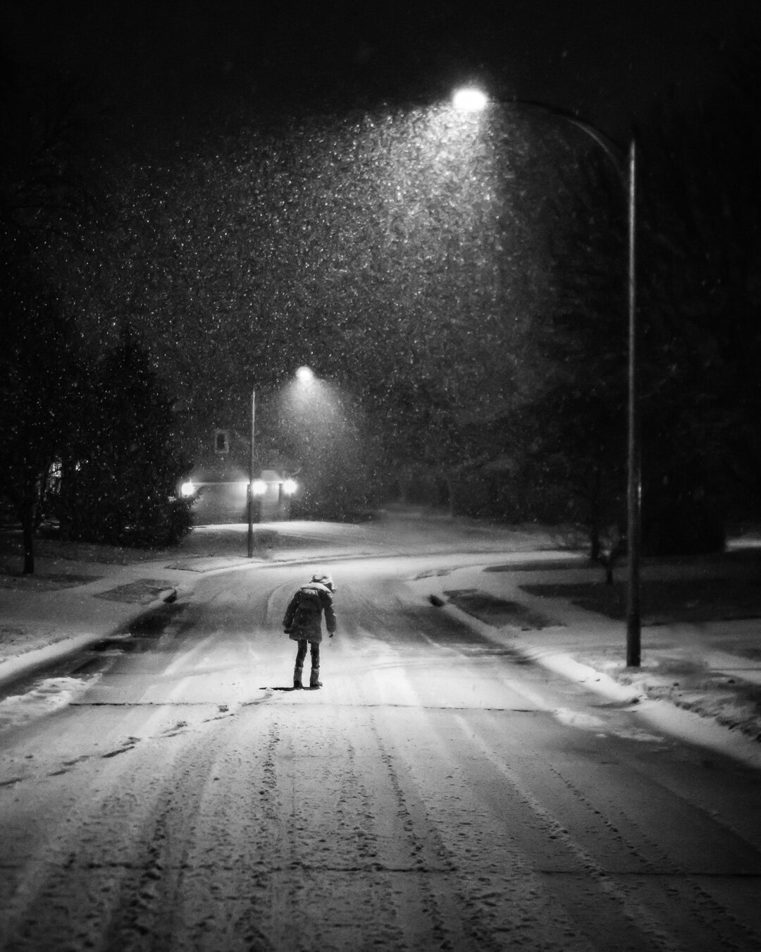
Evoke a sense of timelessness
There’s something about a black and white image that feels like it can transcend time. The first image below was taken during a lifestyle family session. The black and white conversion makes it feel as if this image could be of a father and son from 20 years ago, or 20 years into the future. This was an image I knew I’d be converting to black and white when I took it. The dark, vertical lines of the window frame, and the darker colors in their hair and clothes contrasting with the light background of the window make this image stronger in black and white.

Singular focus
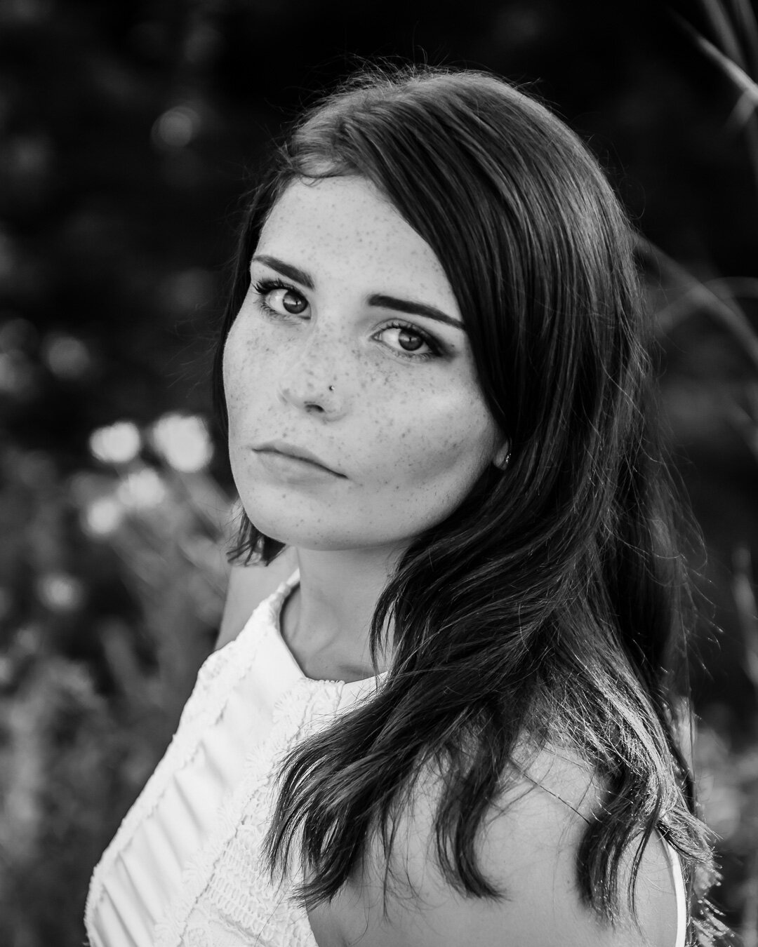
Emotion and connection are a huge part of the images that I shoot, and sometimes, taking away the color enables the viewer to focus more on a singular idea of an image. Parents and their connection to their children. The grit of a senior graduating in the midst of a pandemic. In addition to emotion or connection, sometimes I will convert an image to black and white to enhance the focus of one detail. Look at the example of the senior girl in the last set of images below. I wanted to highlight her gorgeous freckles. Notice how the conversion to black and white enhances this feature better than the color version.


Which image do you think is stronger here? There’s no right or wrong answer!

Minimize distractions
I was given the honor of photographing adoption day for this Nebraska family. While we waited for our time in the courtroom, I took several images in the waiting room. Eliminating the color helps the viewer to focus on the emotions and connection between mom and daughter. When mom & dad took their oaths in the courtroom, I also chose to convert to black and white not only to eliminate distractions, but also to draw singular focus to the moment.

Light and lines
When an image has strong lines, details or contrast in light, I immediately think about converting it to black and white. Take a look at all of the lines and shapes in the following images. The color images on the left are SOOC (straight out of camera) and the images on the right are the edited black and white version. Converting these to black and white enhances the strong lines and shapes in each image.

Interested in seeing more black and white photography ? Click Pro is the professional association that I belong to and each month we have a new project that we can participate in. The Click Pro February project is all about black and white images with depth. You can find all of the images for this month on our Daily Project page. You can also check out my Instagram feed for more black and white photos this month!